


Alex Session 2- InDesign
- jamesdrakes420
- Oct 21, 2022
- 5 min read

Updated: Dec 12, 2022
18/10/22 This is Alex's second workshop going through the basics of using InDesign.

In the first section of this session, Alex went through a presentation. The presentation was explaining important terminology and important features in Indesign that you need to know as designer.


Leading is the space between each line of type. Kerning is the process of adjusting the space between each character. Tracking is when you increase or decrease the horizontal spacing between a range of characters.

The bleed is the lines around the edge of the page, where the ink will carry over. The industry standard bleed is 3mm.

This diagram shows the bleed around the edge of the page.
These images are examples of where bleed has been used. The first example, has a mixture of pages that use bleed and ones that don't. The other two examples use bleed more but it is usually used for a full page of colour, double page spread images, and the continuation of an image off the page.


This section of the presentation goes through the anatomy of a grid, which is important for a designer to know this.

When creating documents in Indesign, you should aim for the range of 35-85 characters.

When designing a book, you should aim for around 35-85 characters in a line. Aiming for this line length , will allow you to fit the paragraphs onto the page an into the grid without hyphenation and organs and widows.

Using a standard point size of 8-11 for reading text is important because anything below that, the legibility can get lost and it can become difficult to read. However anything above that, becomes too large.

The grid should be used to layout and organise all of you text and other assets you are using in your booklet. There should usually be 3,6 or 9 columns.


The text should always sit between the gutters on the grid. This will allow you to lay everything out in an order on the page.

This diagram shows, where all of the elements will be on a page when it has been layed out
Here are some screenshots of an indesign document I created, to use these techniques in practice.


These two images show the creation of the document. These are the settings that I have used.


Here is the creation of a grid, that will be used to layout all of the assets that will be present in the booklet. I have decided to use 6 columns and 6 rows.


Here, is the creation of a new master page. This allows you to assign different pages to different master pages. This allows you to have different grids and layouts on selected pages that are assigned to that master.

Here is an image of the master page, I have documented this to present how I have layed different frames, That I will use to position each asset on the page.

This image shows how to create page numbers. You will need to be on the master page. you'll need to right click on the box you want the numbers to be in, go to insert special characters, then markers, then current page number, to create page numbers that will be created on each page.

This image shows what happens when there isn't enough space in the text frame. The red box with the cross in can be clicked, then the remaining text can be transferred over into another text box.

this image shows the text that has been transferred over into another box. The blue box with the arrow indicates that the text has been transferred over.

this is the use of columns on the grid. The text, fully fits in-between each gutter that it is located between. All of the frames, also line up with each other using each section of the grid.

This is the frame tool, that is used to create the frames where text and images can be inserted.

This is an example of a frame, where you can insert text or photographs.

Here I have used shapes and set the text inside of it using the text wrap tool. The use of this feature can allow you to create layouts that utilise shape as the main features.

Here shows another feature of the text wrap tool, that allows you to place images inside of shapes. These images below are all examples of the use of the text wrap tool. These examples show how you can wrap text around images and images of people, where the person has been cutout.


Personal Development-
Artist Research-
Paul Rand-

Paul Rand was an American Graphic Designer who was best known for his corporate logo designs. Rand was also one of the first commercial American Graphic designers to pick up the Swiss Graphics style. Rand was also influenced by Modernism and the works of Paul Cezzane and Jan Tschichold. (Wikipedia, ND) ,(Rand,P. 2021)
Rand inspired layout-
I was inspired by the Swiss Graphics style and Paul Rands design for the American Democrat. I was inspired by the simplicity of this layout and how the shapes have been use to create the US flag. I decided to create something that was influenced by this because I like the use of the colours and shapes and how simple but bold a layout can be by using the simple features.


Swiss Graphics Barbara Hepworth Poster
This is a poster that was created for a winning Wednesday competition ran by Alex. We had to create a poster that was inspired by Swiss Graphics. This poster had to use imagery that was inspired by Barbara Hepworth

This was created in Indesign and uses assets that relate to Barbara Hepworth. The brief was to create a poster in the style of Swiss graphics that is an advertisement for an exhibition at the Hepworth gallery in Wakefield.

Here are some other examples of what other people created for this brief.
Zine
This was another winning Wednesday brief. This brief was to create a zine that uses imagery taken around the Barbara Hepworth building on campus and was called seeing Barbara. This zine was created in an hour using Indesign.

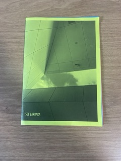

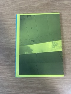


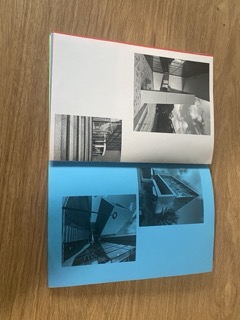

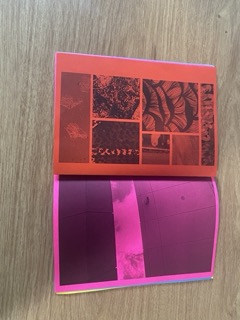


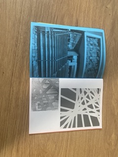
we used coloured paper as the base of the zine and printed the content with black and white ink. We did this to create texture on the paper and to utilise the contrast between the dark tones of the black and white against the brightness of the coloured paper.


I enjoyed this Brief because zines are something that I have wanted to create for a long time. I thought that it would be more difficult but this brief showed me that zines don't have to be complicated and that they can be quick and easy to make.
Sources
Wikipedia. (ND). Paul Rand. en.wikipedia.org. https://en.wikipedia.org/wiki/Paul_Rand
Rand, P. (2021). Life. www.paulrand.design. https://www.paulrand.design/life/


Comments