


Alex: Session 1- Illustrator boot camp and Album Covers
- jamesdrakes420
- Sep 27, 2022
- 8 min read

Updated: Dec 12, 2022
27/09/22
This session was the first session of the year. Alex went through a Presentation going over and refreshing everyones memories on the basics to using Adobe Illustrator.

In this session today, Alex went through a presentation called "Illustrator boot camp" which contained key graphic design terminology and useful shortcuts to use in Illustrator. This presentation was useful as it refreshed my memory on these key terms and shortcuts that I will need to remember when going into the industry after University.

These Terms are key terms that all graphic designers should know. These terms will be important when working industry. I am going to explain each term as a reminder so that I remember these terms and stamp them into my memory so that I never forget them.


Leading is the space between each line of type. This term originates from hand typesetting, where a thin strip of lead was used to increase vertical distance between each line of text. The two images above are examples of leading.


Kerning is the process of adjusting the space between each character. Kerning adjusts the space between each individual character compared to tracking, which is the spacing adjustment of a range of characters in a word to create uniform throughout the typeface.


Tracking is when you increase or decrease the horizontal spacing between a range of characters.

This image compares Leading, Kerning and Tracking. This image also presents the difference between each term as they sometimes they can be confused for each other.

This diagram, shows each term in the context of a sentence. There are also other key terms on this diagram like descender and ascender.

The baseline is the line that the type sits on and that descenders, extend below.

Ascenders are the section of a letter that extends above the mean line of a font.
Descenders are the section of a letter that descends underneath the baseline.

Orphans and Widows are lines at the begging and end of a paragraph left dangling at the top or bottom of a page or column, separated from the rest of the paragraph.

These are the three types of colour modes. RGB is the colour space for digital and web based images. RGB stands for Red, Green, Blue, This colour mode is for screens, because the colours Red, Green and Blue lights, are used to create colour on your screens.
CMYK is the Colour mode for Print. CMYK stands for Cyan, Magenta, Yellow and Key (Black). CMYK format should be used when you are designing something that is going to be physically printed like packaging, physical advertising and branding.
Pantone is a standardized color matching system, which is widely used around the world. It was devised to help printers and designers to specify and control colors for printing projects. The Pantone Color System allows you to specify colors that cannot be mixed in traditional CMYK.

These commands and shortcuts are useful to use, as they speed up the process when using Illustrator and it will help save time when doing briefs for clients.
Illustrator Boot Camp
In this section of the session, Alex went through Illustrator and explained how to do basic techniques that will be useful to use when completing briefs.

In this first section of the task, Alex went through some of the basic features on Illustrator. In this image, it documents the basics that are listed at the top of the image. I have also demonstrated creating shapes by merging layers of objects together and removing sections.

Here is an example of using the anchor points in the characters to change the overall shape of the type. The futurist font was creating by merging shapes together and removing sections of it to create sharper and more angled edges compare to the Futura font that was used to create this new typeface. The Knife typeface was created by manipulating the points in the characters. The points were manipulated by rounding out the edges to create curved elements that resemble the shape of a knife blade.

This logo was also created using layers that were merged to gather. Then using the shape tool, removing the bull head from the letter to create the head shaped cutout.

These logos in this images were created using the mask command, that allows you to place things inside of other objects to combine each layer to create a new object. To do this process, layer your shape or type onto the shapes or images you want to be inside of your object. Select both layers and use cmd and 7 to create a clipping mask. To do text, you need to right click them and click create outline, then you have to ungroup them. Each character will individually need to have its own mask, so you could use different textures or shapes in each letter to create a unique typeface. You can also use clipping masks to put a word inside of a shape, for an example would be the slice logo in the image above.

The surf type in the image above started as a poster, however image trace was used to create the text without the rest of the poster. image trace can be found in the quick actions section in the properties tab. However, use the image trace tool with caution, as it can make the image look tacky.
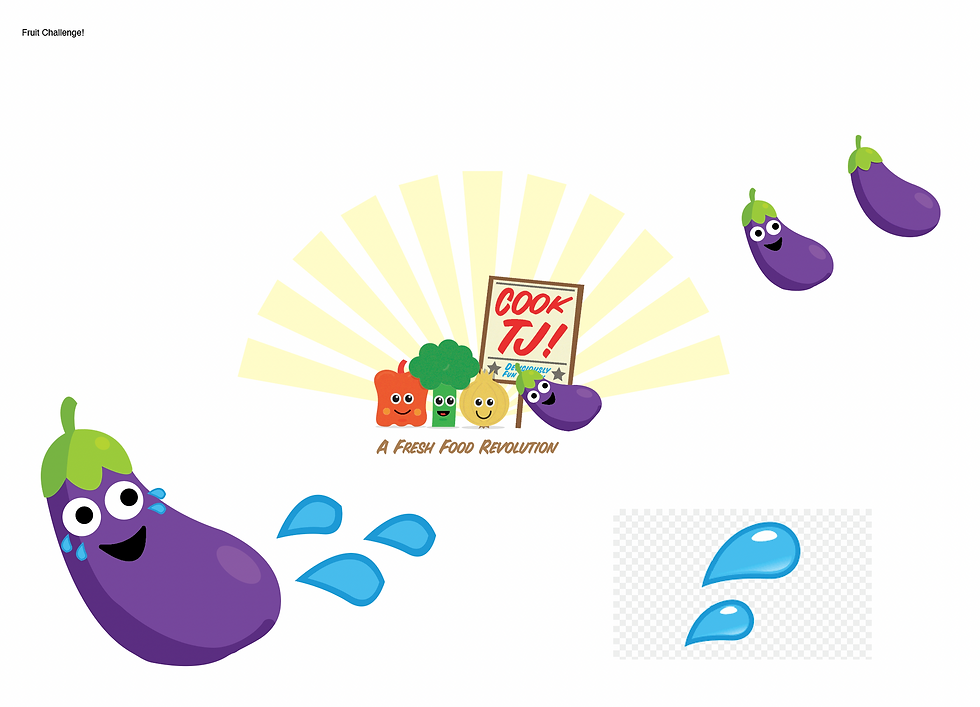
At the end of the boot camp, there was a coipition to create another illustration of a vegetable to fit into this illustration. I created an illustration of an aubergine laughing to go with the rest of the happy vegetables.
Album Covers
This was an optional brief that we were given to create an album cover using illustrator, using techniques that were in the boot camp.
Artist Research-
Vaughan Oliver-
Vaughan Oliver was a British Graphic Designer, who was known for his work with the record label 4AD. Oliver made many designs for artists like The Pixies, Cocteau Twins, Bush and other artists that were on the 4AD Label. His designs are often dark, but they are expressive because they encapsulate the sound of the music. He was a part of a group of British Graphic designers who did album art for smaller and cult bands. The other designers include Peter Saville, Neville Brody and Malcolm Garret (Shaughnessy ,A.2020). At the time, the other designers were all using sans serif type and grids, Oliver was using older typefaces that he found in an antique type specimen book. He also didn't use a grid, so his work became aesthetically more abstract due to being freeform. (Shaughnessy ,A.2020)


Outcomes-

This is a mood board that I created revolving around Illustration based album covers. I looked at a few artists how have designed album covers in the past. I decided to focus on the works of Akashi Murakami, Kaws, Basquiat and Keith Haring. This is because I am inspired by all of their illustration styles. I decided to create multiple versions of the same covers, to create variations of each style.


This cover was inspired by the illustrations Murakami. I created the illustration in illustrator, using the pen tool. The illustration was inspired by the shape and colours from a flame. I decided to create many variations of this cover, to experiment with the space around the flame. The first version of this consisted of 100 smaller flames, on the cover. However this felt a bit crowded, so I decide to change it to four to see if the negative space around the flames adds depth to the cover. The space around the flames, compliments the overall shape of the object. I decided to create a version using only one of the flames to use the space that is present on the cover. I think that having a single flame on the cover feels more effective because it uses the space effectively and isn't congested like the first version was.

Here is a screen shot of the filter gallery in Photoshop. I decided to use this, to create a background for my second idea. I decided to experiment with halftones and textures to create a pop art style background to go with the bright tones present in my skull illustration. I was inspired by Roy Litchenstein's use of halftone and bright tones in his work. This screen shot shows experimentation with the different filters to create the background. The final background uses a halftone pattern and a torn edges filter. I just played around with the swatches to get the effect that I wanted.

A colour balance filter was used to get the purple that is present on the album cover.

This is the Halftone print that is present on the cover. This background compliments the colours that are present in the skull.


The Halftone print creates a denim style texture in the background. This makes the skull look like it is a patch that has been sewn onto a piece of denim. All of the layers on this cover all compliment each other, the softer colours on the skull contrast with the harsh texture present in the background, which creates an interesting combination.

This is an experiment that was created in photoshop. I decided to experiment with the halftone pattern and place it on top of the skull. I did this by cutting around the skull and creating a mask.

I think that I prefer the halftone pattern on the skull instead of in the background. This is because I feel that the pattern compliments the colours more effectively when it is overlayed rather than the contrast that is created when the pattern is present in the background. Also the white sections in the skull, don't have the pattern which also creates contrast. However this also adds to the cover because the sections that aren't halftone, create layers and a divide between the space and the textured pattern.


Personally I prefer this version of this album cover because I feel that the halftone doesn't feel as harsh when it is overlayed onto of the skull compared to when it is in the background of the image. I also think that having sections of the skull where the pattern is not present, compliments the softer tone of the background, where the texture is not present.

This is another Idea that I had for a black and white cover. This cover was inspired by the simplicity of Swiss graphics. I used the shape tool in Illustrator to create this cover. I wanted to create something that was simple but also felt modern and slightly abstract. I feel that this also has an architecture inspiration, due to how the shapes have been laid out. The grey type, was inspired by Metallica's Black album, where the image and type uses a slightly lighter tone compared tho the harsh black that was used for the background.

This is an I idea that I had, that incorporates shape and type. The main features of this cover are the type and shape that use clipping masks of textures that I created using spray paint. I wanted to use texture inside of the objects, as it creates layers onto the cover, that also create a three dimensional aesthetic. I decided to use different images for each section of type and the shape. I did this to create a variety of shades and textures but it also creates a gradient throughout the cover.
Winning Wednesday Album Cover challenge-
This Winning Wednesday brief, was to create an album cover for an artist called Scott Holmes for his song In Awe. We were given the song, to listen to, then create a mood board around the overall feel of the song.

This is the mood board I created from listening to the song. The images were sourced from pexels, so they are copyright free. The song reminded me of dark and abstract imagery due to the unique sounds that it sampled. It also gave me an urban vibe, that reminded me of street art and graffiti in abandoned buildings.

These are the rough ideas that I came up with using the sources that I collected. I was inspired by the urban sound, to create street art inspired covers that incorporate urban locations and graffiti. I decided to create a graffiti tag for the cover to convey the urban feel from the track.

This is the final design that I came up with from the images that I sourced around the song. I decided to choose this cover over the others because I felt that this cover conveyed the over all feeling of the song better. It also presents the feeling in an abstract way, through the use of colour and lighting that is present in the image. This cover was also inspired by Radioheads album cover for their album In Rainbows.

This is the final mockup for the Album. I feel that it is effective and the use of colour really makes it look bold and eye catching. However, if I was to change anything, I would explore different typefaces or different weights of Helvetica. I would explore this because I feel that the type loses illegibility when scaled down.
Sources
Shaughnessy , A. (2020). REMEMBERING VAUGHAN OLIVER. www.creativereview.co.uk. https://www.creativereview.co.uk/remembering-vaughan-oliver/


Comments